Cantoni Abogados
Cantoni needed to present its employment law practice with clarity and discretion. I defined a structure separating who the firm serves, the matters it handles and how to start an enquiry. Visual direction and content share a consistent language.
Case summary
From the starting point to the outcome.
- Initial situation
- An employment law firm needed to align its brand, practice areas, content and contact journey in a restrained digital presence.
- Objective
- Convey judgement and discretion, help visitors identify the type of matter and organise sensitive legal information.
- Solution
- I translated the brand system into an editorial interface with practice areas, articles, principles and clear direct contact.
- Deliverables
- Visual identity, content architecture, responsive web design and development, practice areas, articles and contact.
- Outcome
- A published website with distinct practice areas, articles, a consistent visual identity and enquiry channels. The screenshots show those decisions across the introduction, content and contact sections.
- Next step
- Keep practice areas and articles current and measure which content helps start qualified enquiries.
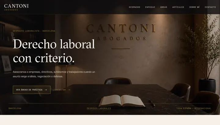
The home page establishes the employment-law focus and links to practice areas and contact. Typography and contrast prioritise the firm’s message.
Typography, colour, imagery and spacing stay consistent across the introduction, services and contact. The screenshots show how the identity is applied.
Information about specialities and audiences appears before the enquiry channels. The design aims to help visitors identify the relevant area before writing.
The specialism, from the start.
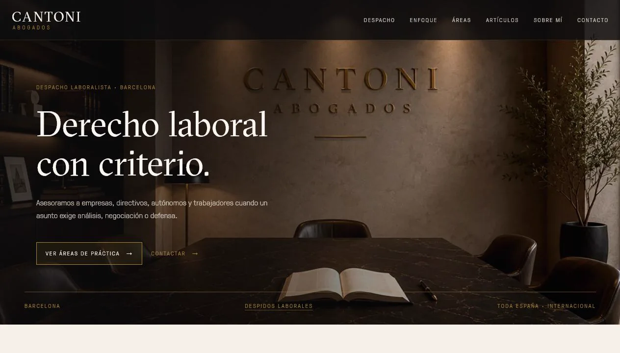
The first screen introduces the employment law firm, Barcelona and two routes: practice areas and contact. A broad image is paired with a short message so the firm’s activity remains clear within the visual identity.
- Prominent header image
- Visible employment-law focus
- Access to practice areas and contact
- Brand present in the header
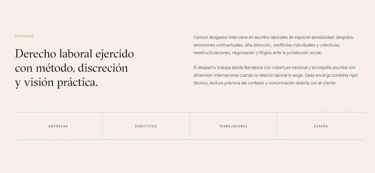
Who the firm serves.
The introduction distinguishes companies, executives and employees and explains the firm’s coverage. This comes before detailed services so visitors can identify the relevant perspective for their enquiry.
- Companies, executives and employees
- Employment-law specialism
- Contact information
- Published service coverage
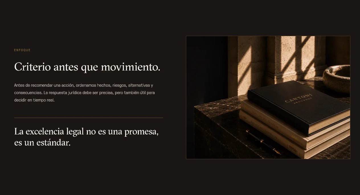
An identity applied to every section.
I used warm black, ivory and gold accents with serif typography and textured imagery. Repeating these choices connects the different sections without relying on repeated logos.
- Black, ivory and gold accents
- Consistent image treatment
- Consistent typographic hierarchy
- Visual identity across sections
Principles visitors can review.
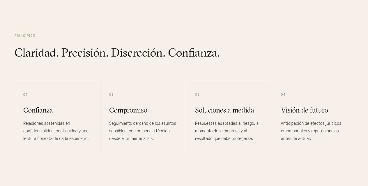
I organised the firm’s stated principles into four numbered blocks. Each combines a heading and a short explanation with a consistent visual hierarchy, presenting the ideas as a connected set.
- Four numbered blocks
- Headings and short explanations
- Principles stated by the firm
- Consistent visual composition
Find the relevant practice area.
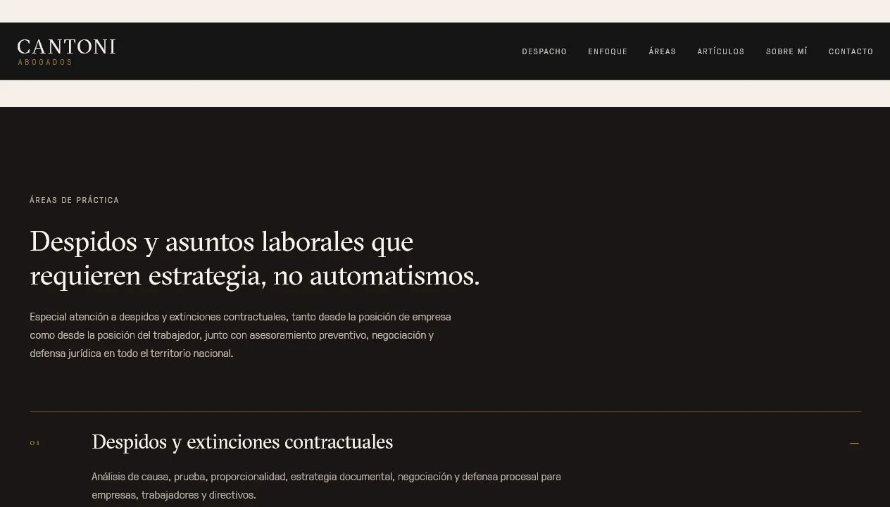
Dismissals and terminations lead the practice areas. Other matters have identifiable headings and expandable details. This preserves an overview while allowing visitors to explore a speciality without displaying every detail at once.
- Dismissals as a prominent area
- Expandable details by speciality
- Descriptive legal headings
- Overview and detailed reading
Content organised around questions.
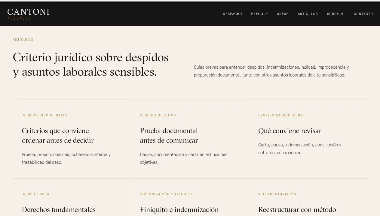
Articles are grouped around recognisable matters: dismissal types, compensation, final settlement and restructuring. The section links to specific content in a presentation consistent with the firm’s practice areas.
- Articles grouped by matter
- Employment-law topics
- Links to specific content
- Connection between articles and services
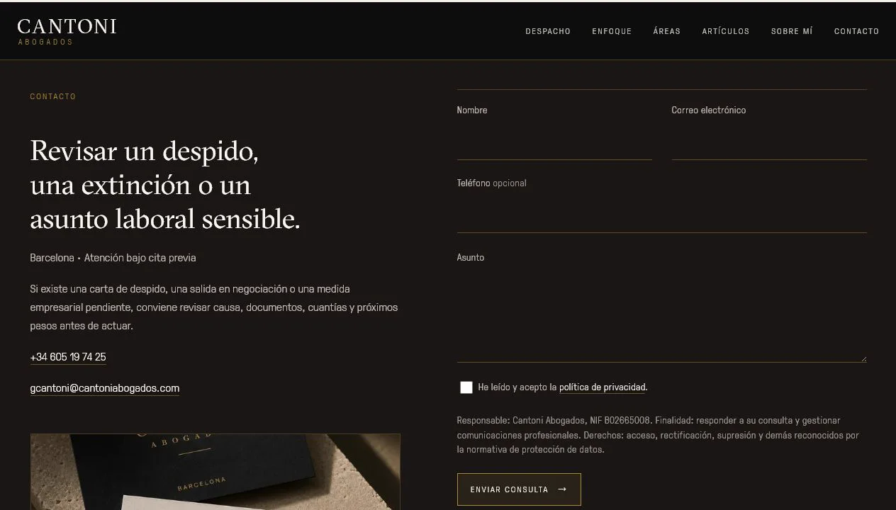
Contact with clear instructions.
The final section provides phone, email and a form with privacy information beside submission. The channels use the same visual treatment as the rest of the website and let visitors start an enquiry without looking elsewhere for contact details.
- Visible phone and email
- Labelled enquiry fields
- Link to privacy information
- Visual consistency through submission
A selection of real work: content, design and contact adapted to the business.