Crece Entrenando
Fran needed to present training and nutrition clearly. I organised the website around three decisions: understanding his method, comparing plans and getting in touch directly. This case study shows how content, design and contact were connected.
Case summary
From the starting point to the outcome.
- Initial situation
- Fran needed to present his training and nutrition services more clearly and turn the website into a useful way to start conversations.
- Objective
- Explain the offer quickly, build trust before contact and provide direct routes to plans, WhatsApp and a video call.
- Solution
- I reorganised the proposition, designed a more professional experience and connected services, method, prices, guide and contact in one journey.
- Deliverables
- Content architecture, visual direction, responsive web design and development, identity and publication.
- Outcome
- Services, method and plans available to review, with WhatsApp access from the offer and final section. The screenshots show the published structure and design.
- Next step
- Measure which content and calls to action lead to conversations so future improvements can be prioritised without unnecessary complexity.
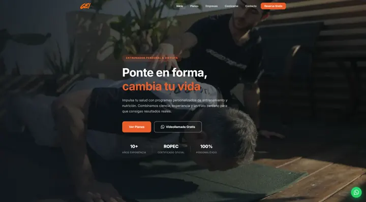
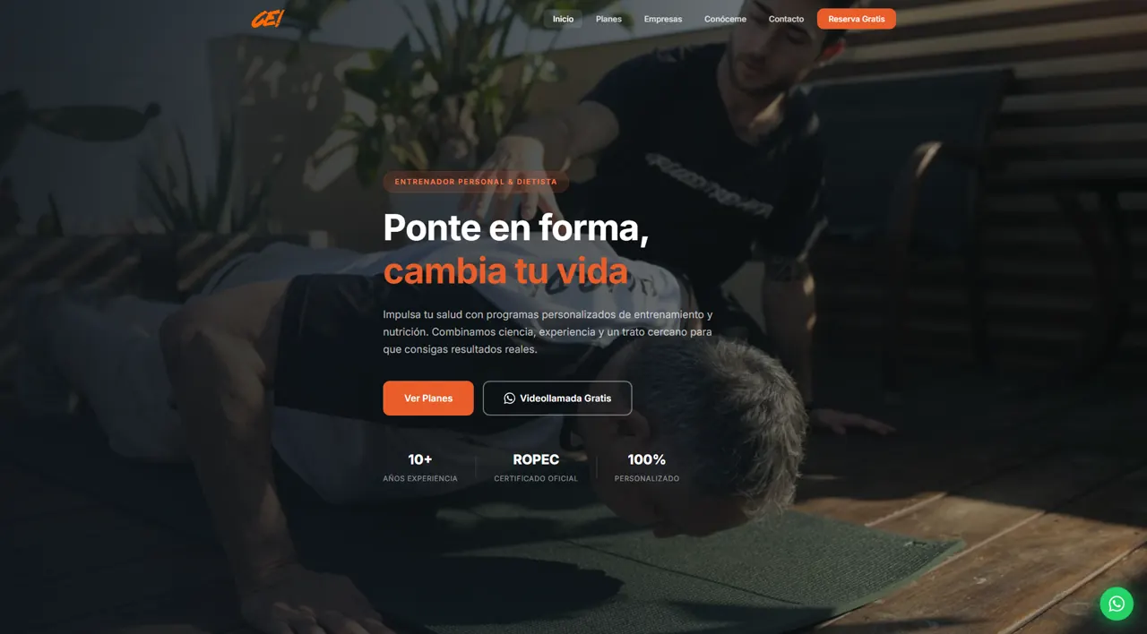
The first screen presents training and nutrition with two visible options: compare the plans or request a video call through WhatsApp.
Plan buttons and the floating contact link open WhatsApp, so visitors can enquire from the service they are considering.
The method, plan details and downloadable guide provide information before contact. This case shows their placement and how they connect to enquiries.
Two routes from the first screen.
The home page combines the service introduction with two different actions. Comparing plans lets visitors explore the offer; requesting a video call opens WhatsApp for those ready to ask a question. The hierarchy separates those choices without requiring a full-page read.
- Service introduction image
- Two routes: plans and a video call
- Professional information beside the offer
- Floating WhatsApp access
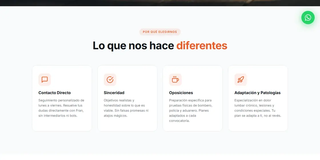
Services that help visitors recognise their needs.
I organised four blocks explaining how Fran presents his work: direct contact, realistic goals, fitness-test preparation and adapted training. Each block answers a specific question about the service.
- Direct contact
- Service goals
- Fitness-test preparation
- Adapted training
The working method, explained upfront.
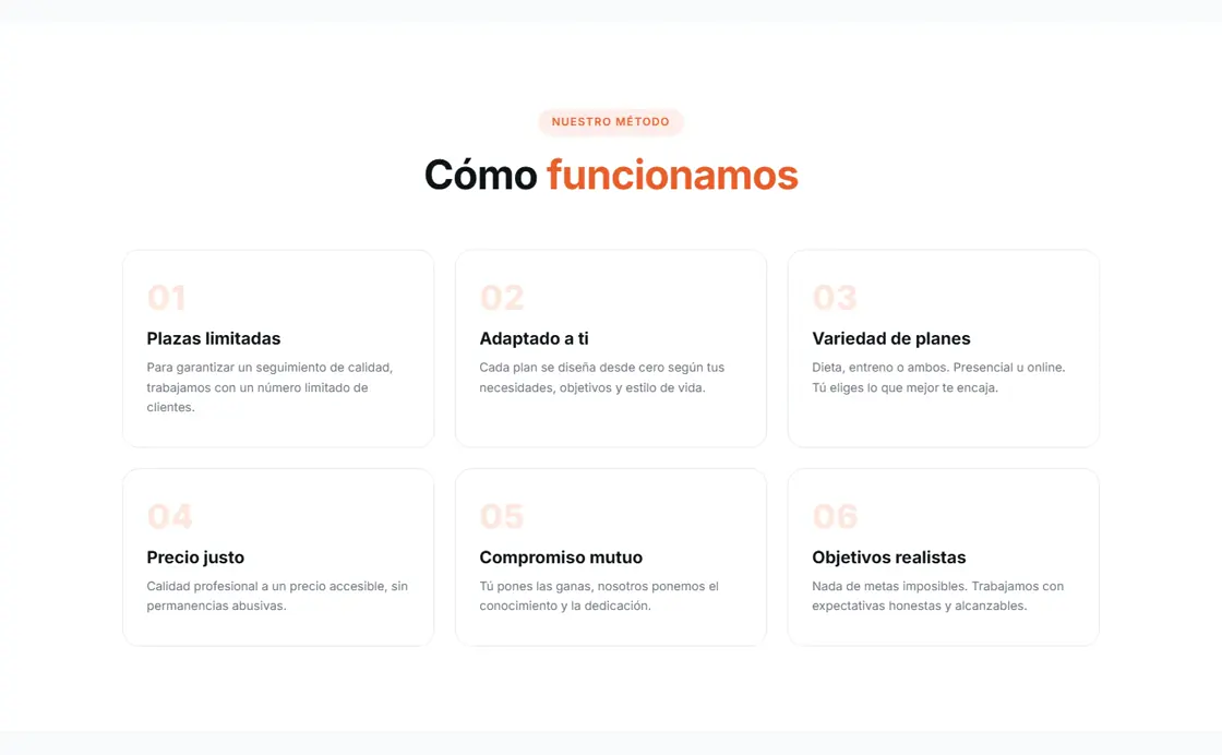
Six numbered blocks introduce the terms and working approach before signing up: availability, personalisation, options, pricing, commitment and goals. The numbering organises aspects of the service that visitors can review before choosing a plan.
- Blocks numbered 01 to 06
- Terms and working approach
- Short explanations by topic
Compare before getting in touch.
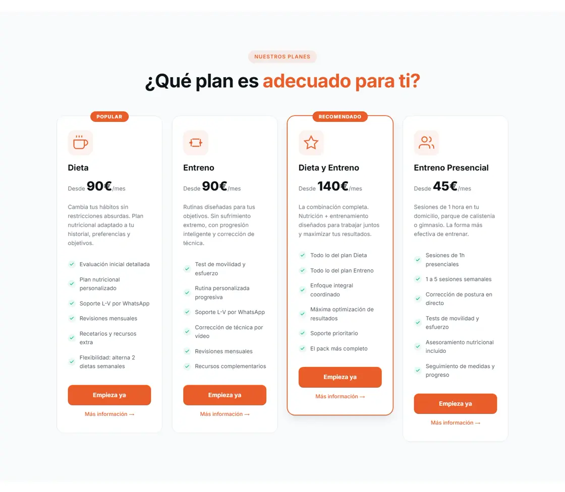
All four options share a structure: name, starting price, details and contact. Visitors can compare nutrition, training, the combined plan and in-person sessions. Each button links to a WhatsApp enquiry.
- Starting prices and plan details
- Consistent comparison structure
- WhatsApp link for each plan
- Access to additional information
A resource for further reading.
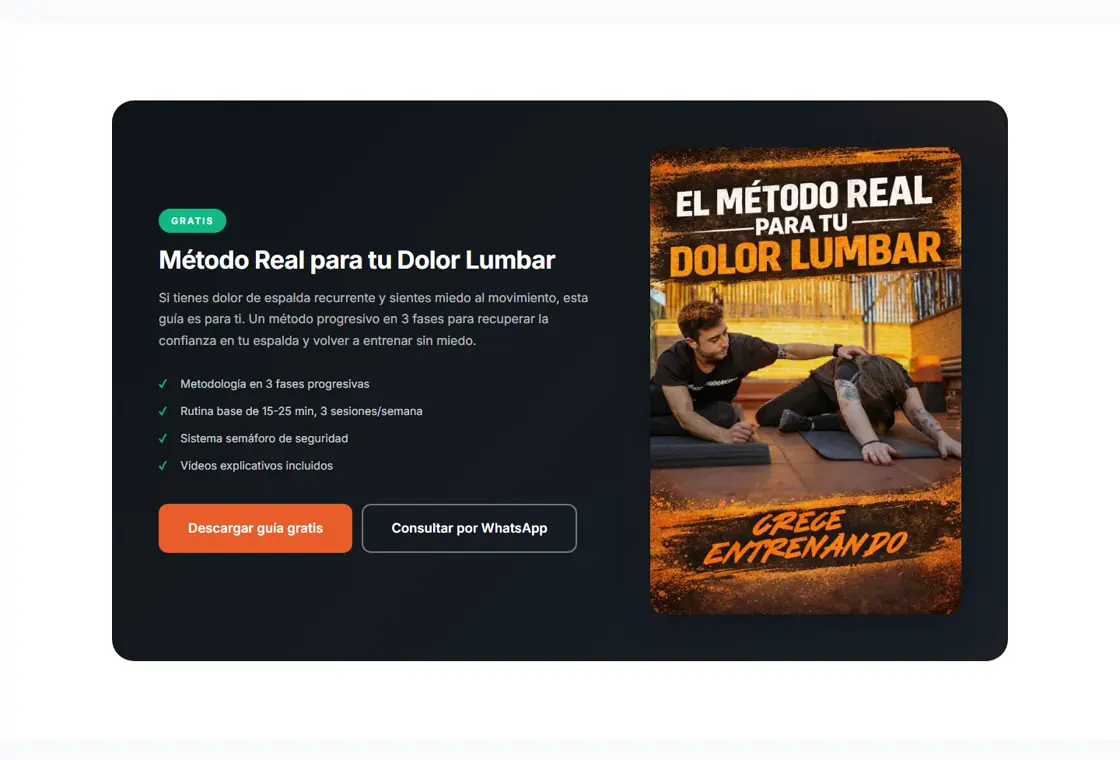
The lower-back-pain guide has its own section explaining the content, with a download link and WhatsApp contact. It provides another way to explore Fran’s offer before choosing a plan.
- Downloadable resource
- Summary of the guide’s content
- WhatsApp contact beside the download
Enquire through a suitable channel.
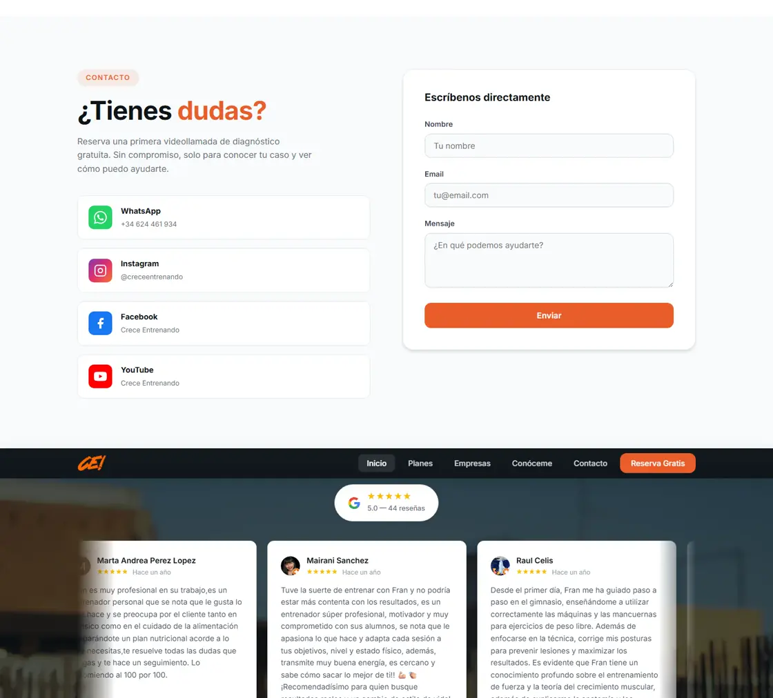
The final section combines a form, WhatsApp, social links and a link to the business’s Google reviews. The options are grouped so visitors can find the available channels when they want to ask a question.
- Form, WhatsApp and social links
- Link to Google reviews
- Access to an initial video call
- Contact channels visible on mobile
Outcome for the business
Services, plans and contact in one journey.
Services, method and plans available to review, with WhatsApp access from the offer and final section. The screenshots show the published structure and design.
The public website provides the services, plans and contact channels. Screenshots document the delivered design and may show an earlier version of the content.
A selection of real work: content, design and contact adapted to the business.