Recognise
The person identifies their goal, starting point or limitation without interpreting generic messages.
Web design for personal trainers
A personal trainer's website should explain who you help, how you work, which plans you offer and how to get started. I prioritise your method, credentials, demonstrable outcomes, location or online format and easy contact in a fast, responsive structure that reduces doubt before the first conversation.
Authorship and reviewJavier Nache
BasisDirect experience and a related case study
Last reviewed
How I prepare and review contentSomeone looking for a trainer does not compare exercises alone. They consider whether the trainer understands their situation, whether the method seems credible, whether the format fits their routine and whether they will feel supported.
The website should make that relationship visible without turning your story into an endless CV. A real photograph, a focused introduction and a clear explanation of the process usually add more than a collection of motivational phrases.
Navigation should answer common questions in the right order. This can be resolved on one well-built page or distributed across several when services and content justify it.
If you offer a small number of services and contact is the primary goal, we prioritise a concise structure. The budget expands only when additional pages, content or functions have a clear purpose.
Conversion without pressure
The page does not need to repeat buttons in every block. It needs to prepare a decision and offer the right channel once the person has context.
The person identifies their goal, starting point or limitation without interpreting generic messages.
The method explains what you will do, how follow-up works and the role of each party.
Services, formats and prices, where appropriate, help decide whether there is a basic fit.
WhatsApp, form or telephone is presented with a clear expectation of the next step.
A page can target searches related to personal training and your service area, provided the content describes a real offer and is not a collection of repeated town names.
Service pages make sense when they answer different needs. Articles or guides help when they answer common questions and demonstrate the professional approach before contact.
Real case study
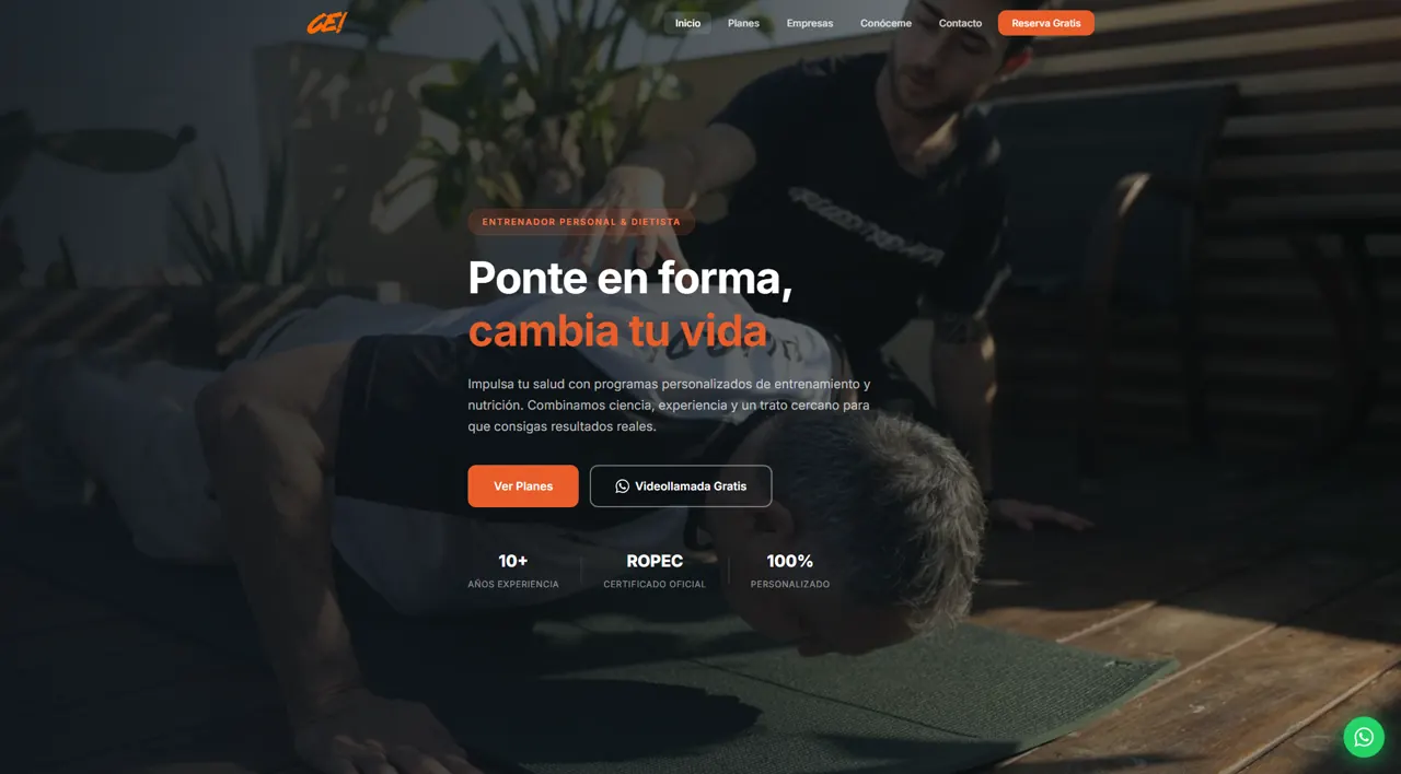
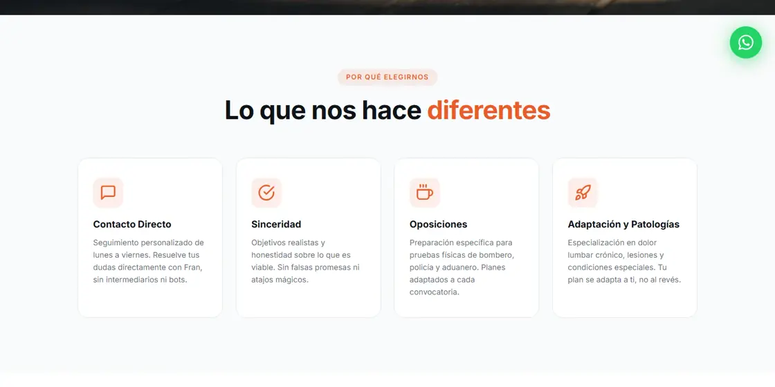
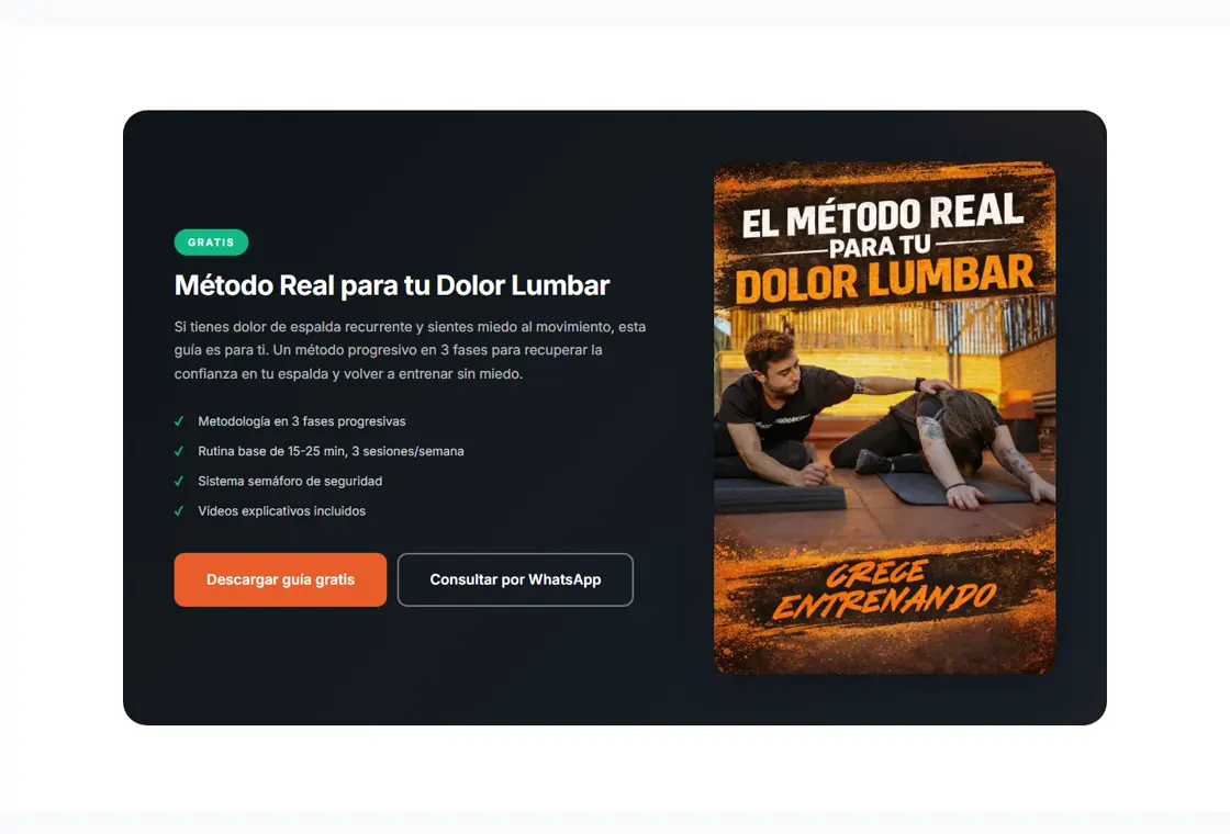
The website presents Fran Henares as a personal trainer and dietitian in Barcelona. It structures differentiators, method, plans, a lower-back-pain guide and several contact routes.
The project included web design and a complete brand book. The journey prioritises approachability and clarity: it first explains why to trust, then how the service works, and finally makes it easy to continue on WhatsApp or request a video call.
View the full case study →I prepare the proposal after reviewing services, content, brand and contact goal. You can distinguish the required foundation from improvements that can be added later.
It should make clear who you help, how you work, which services or formats you offer and the next step. Your introduction, method, frequently asked questions and real evidence help reduce doubt.
Not always. If your plans are defined, showing them can help people compare and filter enquiries. If every case requires an assessment, the website can explain what affects the quotation and guide people towards an initial conversation.
It can help explain where you work and what you offer, and create pages or content related to genuine local searches. Local SEO requires technical consistency, useful content and a well-maintained business presence; it does not guarantee a specific ranking.
Yes. I first review which material already works, from identity and photographs to copy or reviews. The proposal identifies what to preserve, organise, complete or produce again.
Tell me how you work and which type of client you want to serve. I will prepare a proposal matched to the goal and available content.